Magazine-Perfect Rooms
Pictures of perfect living rooms and other house spaces in magazines and catalogs can be a great source of inspiration for decluttering your home. The magazines and catalogs are really aimed at trying to convince you to buy stuff, but they do it by making rooms that highlight the products, a lesson we can all learn from. Let's analyze this room designed by the Pottery Barn:
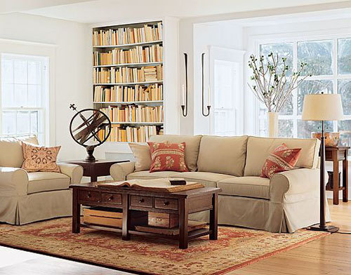
The first thing you should look at it the background. The walls are pure white, very clean, and the windows have a lot of light coming through them. That makes the whole scene seem lighter. Most of us would probably not want to spend a lot of time actually living in a room that has no curtains -- especially at night -- but a similar effect is possible with curtains that pull back completely, or blinds that disappear.
The other thing in the background is the bookcase. It's the same colour as the walls, but the inside has been painted a darker colour, to make the books stand out. And the books themselves are not your usual collection of books, but ones that fit a certain range of colours, arranged in a rhythmic pattern.
The first thing I would ask myself about the bookcase and using it in my own home is whether I was willing to either cover every book I own in coordinated book jackets, or whether I was willing to sort my books by colour. I'm definitely not into either option, so my room will look more chaotic than this one, because the background has extra things going on in it.
Also in the background is a table at the window with a bowl and a vase of branches on it. Look at the scale of those items: they're very large, and they bring the window in closer, but they essentially block off that nook from being used as living space: it becomes purely decorative. How would you furnish that nook? Most people would not make a whole space like that decorative, but it's worth considering. Taking a space that would ordinarily get cluttered up with a window seat and a hundred little pillows and reducing it to a strictly formal arrangement of hard furnishings is a bold design move.
Next to the nook are a pair of candle holders. A lot of people abuse the candles. First: the candles are unburnt and the holders are not caked with melted wax. That look went out in 1979, and now it just looks messy. Second, the candles match each other and the room. Third, the holders make a strong, graphical statement on a blank wall: they add two vertical lines to a wall that seems to disappear by being so bright.
Moving to the foreground, the first thing you should notice is that the furniture is pulled away from the walls. A lot of people decorate a room by putting pieces of furniture all around the walls, leaving a large hole in the center. Unless you have a dance every night, bring the furniture into the middle of the room, around a rug, like you see here. And don't have too much of it. This room has had half the furniture taken out, to get a better camera angle, but it also really opens the room up. One more chair and this sitting space would be perfectly fine for most social situations.
Another thing to notice is that there's very little STUFF. A few items in the coffee table, carefully chosen to coordinate with the furnishings, a couple of books out for effect (clearly a house without cats), and a weathervane. No photos of family, no little ceramic statues, no piles of mail and catalogs. Oddly enough, in this catalog room, there's no sign of the endless barrage of catalogs you would get if you actually ordered this stuff for your home.
Catalog designers throw away the clutter. They clear it out to highlight a few, important things: their products.
Another important thing to notice about the main seating area: there are a few pillows, but they match everything else perfectly. They coordinate with the rug, the books, the couch, the bowl in the window, the wood of the coffee table, the lamp. They are not cute and useless: they are designed to add punches of colour to the room.
Everything in this room has been carefully chosen to fit with everything else. Nothing extra is brought in, and what is there is kept perfectly clean. A real home is not like that: you bring in the mail or take a book down from the shelf (if you can find it with all those covers over the original spines), and the effect is ruined slightly. But by taking the concepts used by the designer of this room and applying them to your own space, you can make your home look a little more coordinated and highlight the things you value the most.